
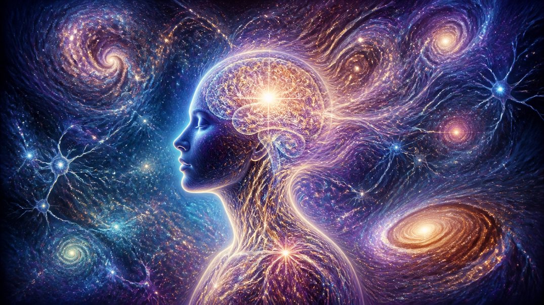
Color is easy to dismiss as a matter of personal taste, a preference that belongs in the same category as favorite music or coffee order: genuinely individual, mildly interesting to discuss, and unlikely to have consequences beyond the aesthetic. The research on color and cognition suggests this is wrong, and not in a small way. The colors of the environments people inhabit have measurable effects on attention, mood, creative performance, and physiological arousal state that are consistent enough across individuals to constitute real environmental influences on cognitive performance rather than purely subjective responses to visual preference.
This is not the soft pseudoscience of color therapy or the confident overstatements of interior design marketing, both of which have done the legitimate research a disservice by association. The science of environmental color and human performance is a genuine area of study in environmental psychology, and its findings are specific enough to be practically useful to anyone who has any control over the visual environment in which they work, think, or try to recover from either.
How the Brain Processes Color Beyond Seeing It
Color perception is not a passive recording of wavelength information. It is an active construction process that involves the visual cortex, limbic structures involved in emotional processing, and the autonomic nervous system, all of which respond to color in ways that extend well beyond the conscious experience of seeing a particular hue. Some of these responses have evolutionary roots in the associations between color and environmental conditions: the blue of open sky and open water, the green of vegetation and safety, the red of blood and threat. Others are learned cultural associations. Both types operate with a speed and automaticity that precedes conscious interpretation.
The Autonomic Response to Color
Research measuring physiological responses to color, including heart rate, blood pressure, skin conductance, and cortisol, has established that warm, saturated colors, particularly red and orange, produce measurable increases in physiological arousal: elevated heart rate, heightened skin conductance, and a sympathetic nervous system shift that reflects increased alertness and activation. Cool colors, particularly blue and green, produce the opposite: reduced heart rate, lower blood pressure, and a parasympathetic shift toward the calm, focused relaxation that the nervous system associates with safety and ease. These responses occur within seconds of exposure, before any deliberate interpretation of the color has taken place, and they are consistent enough across populations to represent a genuine biological response rather than a purely culturally mediated one.
The Wavelength-Brain Connection
Part of the physiological response to color involves the same photoreceptive pathways that regulate circadian rhythms, particularly the intrinsically photosensitive retinal ganglion cells described in the natural light article. Short-wavelength blue light has direct stimulating effects on the suprachiasmatic nucleus and the alerting systems it governs, which is why blue-heavy environments and blue-shifted light sources produce measurable increases in alertness, processing speed, and reaction time. Longer-wavelength red light has different effects on these systems, producing the warmth and relaxation associations that make red-heavy environments feel more intimate and, in specific contexts, more physiologically activating in a way that is closer to the sympathetic stress response than to calm alertness. The color of a room is, in this sense, partly a light spectrum choice with direct neurological consequences that operate through the same pathways as daylight exposure.
Red: The Double-Edged Cognitive Tool
Red is the most studied and most contextually complex of the colors in the cognitive performance literature, and its effects depend more heavily on the nature of the task than almost any other color.
Red and Detail-Oriented Performance
Research by Ravi Mehta and Rui Zhu, published in Science in 2009, found that red environments improved performance on tasks requiring careful attention to detail, error detection, and memory for specific factual material. The proposed mechanism involves red’s arousal-elevating effects: increased sympathetic activation sharpens focused, local processing and promotes the kind of careful, precision-oriented cognitive style that detail work requires. Red appears to function as a cognitive signal for vigilance and care, activating the attentional narrowing and heightened monitoring that serves tasks where mistakes are consequential. Proofreading, financial reconciliation, laboratory protocols, and similar precision activities show performance benefits in red or red-accented environments that are not seen in blue or neutral ones.
Red and Creative Performance
The same arousal elevation and attentional narrowing that helps with precision tasks consistently impairs creative and generative performance. Mehta and Zhu’s research found that blue environments produced significantly better performance on tasks requiring imagination, novel association, and open-ended creative thinking, while red environments produced the opposite pattern. The reason is consistent with what the broader arousal-performance literature would predict: creativity benefits from a state of relaxed, expansive, loosely directed attention in which remote associations can form freely, while the heightened, focused arousal of red-colored environments narrows attention in ways that suppress the divergent thinking that creative work requires. The ideal color for the focused analytical desk and the ideal color for the creative brainstorming room are, according to the research, different colors for reasons that are neurologically coherent rather than arbitrary.
Blue and Green: The Restorative Spectrum
The cognitive case for blue and green in working environments is one of the more consistent findings in environmental color research, and it connects to the nature-brain research in ways that help explain why the effects are as large as they are.
Blue and Creative Performance
As established in the Mehta and Zhu research, blue environments produce measurably better performance on creative tasks than red environments, with effects attributed to the calming, expansive associations of blue that promote the open, exploratory cognitive style creative work requires. Blue is also associated with the open sky and open water, environments that the human brain has been associating with safety, possibility, and the absence of immediate threat for hundreds of thousands of years. The cognitive effects of blue may be partly an expression of the same evolutionary conditioning that makes natural environments restorative, activated not by actual nature but by the color wavelengths most strongly associated with it.
Green and Attention Restoration
Green occupies an interesting intermediate position in the color-cognition literature, with research suggesting particular benefits for attention restoration and sustained cognitive performance over time. A study by Kate Lee and colleagues in the United Kingdom found that a brief exposure to a green image during a repetitive cognitive task produced measurable improvements in sustained attention performance compared to equivalent exposure to red or grey images, suggesting that green stimulates the involuntary attention restoration process described in the Attention Restoration Theory research. Green’s association with vegetation and natural environments may activate the same restorative mechanism that actual nature exposure produces, at a reduced but still meaningful magnitude. For environments where long-duration cognitive work is primary, the addition of green elements, including plants, green-painted accent walls, or nature imagery, appears to support the attention maintenance that extended sessions of focused work require.
The Saturation and Brightness Dimensions
Hue alone does not determine a color’s cognitive effects. Saturation and brightness interact with hue in ways that modify the cognitive outcome, and understanding these interactions makes the research considerably more practically applicable than a simple color recommendation would be.
High Saturation, Arousal, and the Right Context
Highly saturated colors, regardless of hue, produce stronger arousal responses than desaturated or muted versions of the same color. A deeply saturated cobalt blue produces more stimulating effects than a muted dusty blue, and a bright red produces more alerting effects than a soft terracotta. This means that the practical advice to “use blue for creativity” is modified by the saturation level: a highly saturated, vivid blue shares the arousal-elevating properties of warm colors to a degree that a softer, muted blue does not. Research on optimal color environments for sustained cognitive work generally points toward colors that are moderately saturated rather than intensely vivid, with higher saturation appropriate for environments intended to activate and energize and lower saturation more suitable for environments intended to support long-duration concentration and recovery.
Brightness, Mood, and Seasonal Patterns
Brightness, the overall luminance of the color environment rather than its hue, has strong independent effects on mood and energy that operate through the same circadian and alerting pathways described above. Higher brightness environments consistently produce elevated mood, higher energy, and better cognitive performance on attention tasks than dim environments of the same color, which is the visual environment equivalent of the morning light effect. The practical implication is that the color choice for a working environment should not be made independently of lighting decisions: a well-chosen color in a poorly lit room will underperform a less carefully chosen color in a brightly lit one, because brightness is a stronger driver of the autonomic alerting response than hue.
Applying the Research Without Repainting Every Room
The practical takeaway from the color-cognition research is not that everyone should immediately repaint their working environments in a particular shade of blue or install red accent walls for detail work. Most people have limited control over the colors of their physical environments, and the effects described above, while real and consistent, are not so large that the wrong wall color makes serious cognitive work impossible.
What the research does support is a set of practical principles worth applying where control is available. For creative, generative, and brainstorming work, cooler, softer colors create a more neurologically supportive environment than warm, saturated ones. For detail-oriented, precision-critical, or error-detection work, warmer accents, including the use of red in small doses such as desk accessories or ambient elements, may provide a helpful arousal boost without the discomfort of a fully red environment. For environments intended to support long-duration focus, green elements, particularly living plants, provide the double benefit of color-mediated attention restoration and the actual biophilic effects of living nature. And for all environments, brightness matters more than most people realize, and the cognitive benefits of color choices operate most powerfully when they are combined with adequate, well-timed light. Color is not destiny, but it is not neutral either, and a room that is working against your brain rather than with it is an environmental variable that warrants at least as much attention as the software you use to do your work.