

There was a time when turning on a computer meant staring into a black screen with blinking green text. You’d type something like “dir” or “run” and hope it did what you wanted. There were no icons, no drop-down menus, no cute animations to guide you. It was basic. Brutal, even. And yet, many users of that era developed a surprisingly solid grasp of how their systems worked.
Fast forward to now. Tap, swipe, pinch, speak—a single interface might respond to dozens of inputs across layers of features. It’s sleek and powerful, but it’s also more complex than ever. And while today’s interfaces promise ease of use, many users feel lost in the labyrinth of features, updates, and hidden settings.
That contrast raises a provocative question: did the simplicity of older user interfaces (UIs) actually help users build better mental models of how systems worked? Or were they just making the best of what they had?
Contents
- What Is a Mental Model, and Why Does It Matter?
- Why Early Interfaces Demanded—and Built—Stronger Mental Models
- The Modern Trade-Off: Convenience vs. Comprehension
- The Role of Feedback and Consistency
- Can Better Cognitive Tools Help Navigate Complex UIs?
- Building Better Interfaces—and Better Mental Models
- The Old Teaches the New
What Is a Mental Model, and Why Does It Matter?
A mental model is a user’s internal understanding of how something works. When you flip a light switch, you assume it connects to the light. That’s your model of the system. In user interface design, mental models help people anticipate how digital systems will behave. If an app feels “intuitive,” it likely matches the user’s mental model.
The closer a UI design aligns with how users expect things to work, the easier it is to navigate, learn, and trust. But when an interface contradicts those expectations, frustration and error spike. Supporting the development of accurate mental models is critical—not just for usability, but for long-term user satisfaction and digital fluency.
Why Early Interfaces Demanded—and Built—Stronger Mental Models
Older interfaces, by necessity, were lean. A command-line interface like MS-DOS didn’t have room for ambiguity. You had to know what you were typing and what it meant. Typing “cd games” made you change directories. Typing “format c:”—well, that could erase your hard drive. The stakes were high, and the instructions were direct.
Graphical user interfaces (GUIs) brought visual metaphors into the mix: desktops, folders, trash cans. These helped users form spatial and functional analogies to the real world. You “dragged” a file into the “trash,” mirroring a physical act. It wasn’t just charming—it was cognitively effective.
Because of these limitations and analogies, early users developed a layered, procedural understanding of how the system worked. There were fewer affordances (features that tell you how to use them), but that very limitation nudged people toward mastery.
The Modern Trade-Off: Convenience vs. Comprehension
Fast-forward to the touch-screen era. Today’s interfaces are marvels of design, but they often abstract away the logic behind what’s happening. Tap here, something changes. Swipe there, another menu appears. The user doesn’t need to understand why—only how.
This ease of use is intentional. Designers aim to lower the cognitive load. But by doing so, they may unintentionally weaken the user’s mental model. Users can end up with a fragile, superficial understanding of their tools—easily disrupted by software updates, new gestures, or moved buttons.
For example, a user may rely entirely on a visual button layout. When a redesign hides or rearranges those buttons, they’re suddenly lost. In contrast, a user with a mental model of the underlying process (e.g., “to export a file, I need to find the share options”) can adapt more easily.
The Role of Feedback and Consistency
One advantage of early UIs was clear, immediate feedback. Type a command, and the system replied. Often cryptically, but consistently. Today, UI feedback can be obscured by animations, delayed by loading screens, or distributed across multiple screens.
Consistent and visible system behavior is essential for building strong mental models. If pressing a button sometimes opens a menu and sometimes doesn’t—depending on the app context—the user can’t form a reliable understanding of what to expect.
That’s why modern designers use patterns like progressive disclosure (showing more options as needed) and affordance cues (visual hints like shadows or outlines) to signal intent. But even these aren’t foolproof. When design choices prioritize aesthetic over function, users may feel disconnected from how things actually work.
Navigating today’s digital interfaces requires working memory, attention control, and pattern recognition. These are cognitive resources that can be trained—and even supported with nutritional and supplemental strategies.
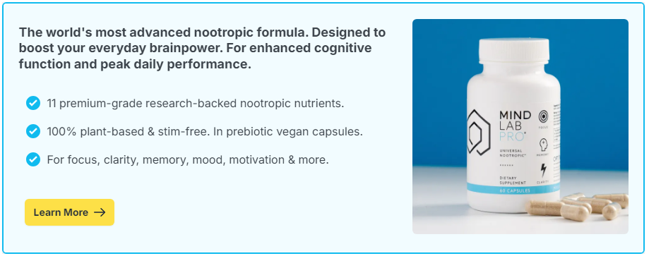
For example, nootropic supplements that support memory, mental clarity, and learning may help users adapt to evolving interfaces or retain multi-step procedures. Ingredients like:
- Citicoline: For mental clarity and neural communication
- L-theanine: To promote calm focus during learning or troubleshooting
- Bacopa monnieri: For memory consolidation and task fluidity
- Panax ginseng: For stamina and cognitive endurance
While nootropics won’t magically turn a poor UI into a good one, they can enhance the brain’s ability to manage complexity, adjust to new layouts, and maintain composure during digital friction—especially when paired with deliberate learning and mental model building.
Building Better Interfaces—and Better Mental Models
The takeaway here isn’t that we need to return to black screens and green text. Rather, we should ask: how can modern interfaces empower users to understand why things happen—not just how to click?
This might mean:
- Designing visible pathways through processes (like step-by-step progress indicators)
- Offering user education through interactive onboarding or tooltips
- Providing consistent visual and behavioral patterns across updates
- Giving users more transparency into system actions and logic
Encouraging mental model formation isn’t about making things harder—it’s about fostering confidence, adaptability, and digital literacy.
The Old Teaches the New
The UIs of the past demanded mental effort—and as a result, often delivered stronger cognitive engagement. Today’s designs favor accessibility and speed. The challenge is finding the sweet spot: UIs that are intuitive and empowering.
That means supporting users not just through design, but through brain-friendly strategies—like building in reflective pauses, reducing overload, and even considering cognitive enhancers that support mental clarity.
Because ultimately, a good UI doesn’t just make things easier. It makes users smarter.