
Have you ever wondered why a bright blue sky can make you feel calm or why a fiery red can evoke feelings of excitement or urgency? These sensations are not just random; they are intricately linked to how our brain processes and interprets colors. Understanding the science behind color perception can offer fascinating insights into how we experience and create art.
Contents
The Basics of Color Perception
Color perception starts with light. Visible light consists of different wavelengths, each corresponding to different colors. When light rays hit an object, the object absorbs some wavelengths and reflects others. For example, a ripe tomato absorbs most of the wavelengths, but it reflects red, which is why we see it as red.
However, seeing color is not just about the eyes doing their job. It involves complex processes in the brain. When light enters the eye, it hits the retina, where photoreceptor cells known as rods and cones come into play. While rods are responsible for vision in low light, cones are crucial for detecting color. Humans typically have three types of cones, each sensitive to different wavelength ranges: red, green, and blue.
Color Mixing in the Brain
The brain takes the information from these cones and mixes it to create the full spectrum of colors. This process is known as trichromatic color vision. The brain interprets the varying levels of stimulation from each type of cone to perceive different colors. For instance, if both red and green cones are stimulated, the brain might interpret that as yellow. This neural mixing is why we can enjoy a diverse palette of colors, from the vivid hues in a painting to the subtle shades in a sunset.
Emotions and Colors: The Psychological Impact
Colors are more than just visual elements; they have psychological effects that can subtly influence our emotions and mood. This connection is why designers and artists carefully choose colors to evoke specific feelings.
Here’s a simple breakdown of some common color associations:
- Red: Often associated with passion, energy, and excitement. It can also signal danger or urgency.
- Blue: Typically linked to calmness, trust, and stability. Blue tends to slow down the body’s metabolism and creates a soothing effect.
- Yellow: Represents happiness, creativity, and warmth. It’s a color that can lift moods and foster a sense of optimism.
- Green: Symbolizes nature, growth, and harmony. Green is easy on the eyes and encourages a sense of peace.
- Purple: Relates to luxury, mystery, and spirituality. It’s often used to convey depth and introspection.
Understanding these associations helps artists use color deliberately to communicate emotions and themes in their work. It also explains why art can have profound emotional impacts on those who view it.

Creating Art with Color
Artists consciously use color to convey messages and emotions, much like a writer uses words. The choice of color palette can define the tone of a piece of artwork, influence the viewer’s emotional response, and even guide the story being told through art.
The Role of Color Theory
Color theory is a fundamental tool for artists. It provides a framework for understanding the relationships between colors. Through concepts like the color wheel, artists can ascertain which colors complement or contrast with each other. This knowledge is crucial for creating harmony or tension within a piece of art.
Primary, secondary, and tertiary colors form the basis of these relationships. Artists mix these colors to achieve the desired effect, whether it’s creating depth, focus, or movement within their work.
Color Psychology in Art
Artists also delve into color psychology, using colors to suggest certain feelings or to evoke memories. For instance, a painter might use cool colors like blue and green to create a serene landscape, while using warm colors like red and orange might express dynamic movement in a bustling city scene.
Moreover, artists often consider cultural meanings of colors, as these can vary widely. For instance, white is typically associated with purity in Western cultures but is the color of mourning in some Eastern traditions. Being sensitive to these nuances allows artists to communicate effectively with a diverse audience.
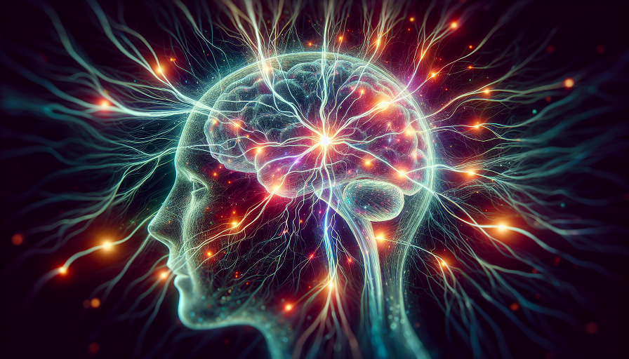
The Brain’s Role in Artistic Creation
The brain doesn’t just passively interpret the colors; it actively participates in creating art. It is your brain that decides how to apply those color theories and emotions onto the canvas. The creative process involves several brain areas, including those responsible for planning, decision-making, and emotional response.
Studies in neuroscience suggest that the brain’s right hemisphere plays a significant role in creative tasks, including art and color processing. This hemisphere excels at recognizing patterns, interpreting visual imagery, and understanding spatial relationships, which are all crucial when working with colors and creating art.
Moreover, creating art can positively affect the brain. Engaging in artistic activities has been shown to boost mental health, enhance problem-solving skills, and foster a sense of well-being. It’s a two-way street where the brain not only influences how art is created but also benefits from the creative process itself.
Color Perception and Individual Differences
Interestingly, not everyone perceives colors the same way. Some people experience color blindness, where they may not see certain colors or may interpret colors differently. This condition arises from differences in the cones within their retinas. Color blindness can range from difficulties distinguishing between red and green to complete absence of color perception (monochromacy).
Additionally, there are rare conditions, like synesthesia, where a person might see colors when hearing music or reading words. This cross-wiring of the senses can make for a unique and vibrant artistic expression. Artists with synesthesia often describe their experiences as inspirational, offering them a distinct perspective that significantly influences their work.
These individual differences highlight the brain’s incredible adaptability and the vast spectrum of how art and color can be perceived and expressed.
Enhancing Cognitive Function with Brain Supplements
The intricate process of color perception and the creation of art is not only stimulating but also beneficial for cognitive health. As we age, maintaining optimal brain function becomes increasingly important. This is where brain supplements, often referred to as nootropics, come into play. These supplements are designed to enhance cognitive functions such as memory, creativity, and even mood – all crucial elements when engaging with art and color.
Popular ingredients in these supplements include omega-3 fatty acids, often found in fish oil, which are known for their brain-boosting properties and supporting overall brain health. Ginkgo biloba, an ancient plant extract, is another commonly used nootropic that may improve blood circulation to the brain, potentially enhancing mental clarity and focus.
L-theanine, an amino acid found in tea leaves, is celebrated for its calming effects without causing drowsiness. This can be particularly beneficial for artists seeking to reduce stress and enhance concentration during the creative process. Additionally, caffeine is frequently included in these supplements for its well-documented ability to improve alertness and attention.
By incorporating brain supplements into your routine, you may discover enhanced cognitive functions that make your interaction with colors and art even more enriching. Whether you’re creating, viewing, or simply enjoying art, supporting your brain health can be an invaluable investment in long-term mental acuity and creativity.
The Endless Palette
The science of color perception offers a glimpse into how intricately your brain is wired to interpret and create art. From the retina’s cones capturing light waves to the brain’s interpretation and emotional response, your perception of color is a complex, multi-faceted process. This understanding not only enriches your appreciation for art but also underscores the powerful influence colors have on your emotions and mental states. As artists and viewers, being mindful of these processes allows a deeper and more meaningful interaction with art, a testament to the beauty of our perceptive abilities.